Zero.
Dollars.
The reason is we have a wee bit of credit card debt. Oh the shame! It's from our airline tickets to Korea to adopt Delaney. So until we get that paid off, I'm going to have to start moving away from the mom cave. Except maybe a couple small things on my to-do list, all the projects I have left are ones that, you know, require actual money.
Just keeping it real, peeps. Real people, real budgets. Even $0 budgets.
There's a reason I am able to move to the kitchen. Our local Menards had free paint last week. Free happens to fit my $0 budget nicely.
Cream and white flat paint was on sale for $11 with an $11 rebate. So I purchased 4 gallons of cream. And semi-gloss white was on sale for $13 with an $11 rebate. Purchased 1 of those for trim.
Dangit! I'm already over budget by $2.
Can you tell I'm stalling because I'm afraid to show you the ugliness? I wish I could blame it on the previous owners. I wish I could say "Orange and red cabinets?! What were those previous owners thinking?" Nope, it was all me.
So, how's the weather over there? Nice and spring-y?
What? Oh, the pictures? Yeah, yeah, yeah. Without further ado...
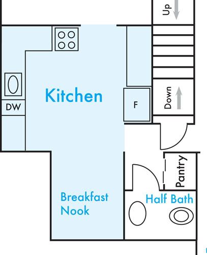
This is the kitchen layout.
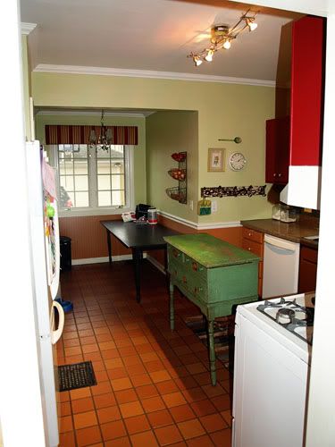
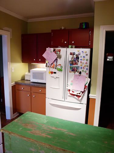
It's not huge, but it's workable. Of course I have plans to make it even more so. And this is what it looks like. Looking from the dining room into the breakfast nook.
You thought I was kidding about the orange and red cabinets, weren't you? Nope.
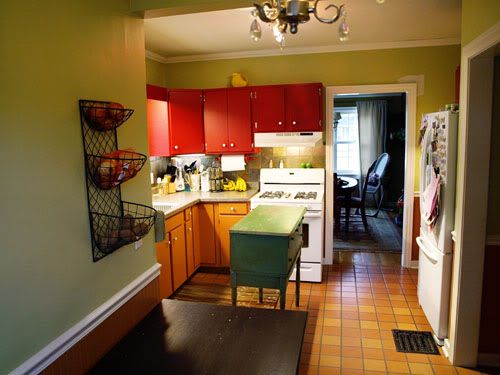
And the opposite direction. From the breakfast nook toward the dining room.
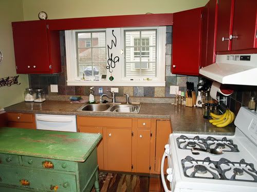
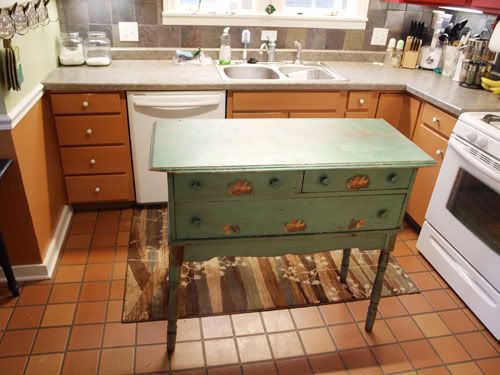
The sink area.
That swiggly black thing is a wine rack. It's quite cool, but looking at it now, I think it needs a home elsewhere.
And the opposite side, the fridge area.
I feel like I owe you an explanation as to why it looks like a rainbow threw up in my kitchen. The orange, fake terracotta floors were existing when we moved in. And I felt like I had to make them look like an intentional choice.
The adjoining dining room was red when we moved in, and I liked red at the time, so I decided to keep it. I found some fabric at HobLob with red, orange and green stripes (in fact they still sell it) and I used those EXACT colors for most of the main areas of my home when we moved in 7 years ago. Really intense, saturated COLOR. And that is why it looks like a rainbow threw up in my kitchen.
We put up the slate backsplash when we moved in. I thought it made the existing laminate look more real.
I don't like it anymore. Any of it.
The appliances are new. We bought them less than a year ago. I have no idea how, but Mr. RBR talked me out of stainless (for some weird reason he doesn't like it). So they're white. And they're staying.
I brought in this buffet for more prep surface and a little bit more storage.
I still like this old thing, but it has to go. This room is way too small for an island. If we can move the microwave off the countertop, I'll have the exact same amount of prep space I do now.
I have major dreams for this space, but our present budget situation means it's gonna take awhile. And I can tell by the pictures, a major declutter and some de-coloring are going to make a big difference right away.
Thanks for looking. I hope you'll stick around to see it through!
Now go make something!

The kitchen looks funny now ;) I think everyone is familiar with moments in which the budget is to zero. Do you have some color left? Then paint the legs from the breakfast table and the chairs in different colors and try to find a suitable wax cloth for the table top. Of course also for $0. That would please me very well: individual, unique and funny ;)
ReplyDeleteEnjoy this Wednesday
Tine
Very funny, Tine. ha!
ReplyDeleteI love your blog! And I am in the same boat as you right now! Lots of dreams for updating my house, but no budget for it as of now! Your current designing is adorable! I love your style! =)
ReplyDeleteI don't think your kitchen is as bad as you think. I like the all the colors but I totally understand the absolute need for change.
ReplyDeleteGreat deal on the paint, can't wait to see how it looks painted.
Traci
I can't wait to see what you do to your kitchen. I know you will do something amazing!
ReplyDeleteGreat blog!
-Alyson @ www.peacefulmamma.blogspot.com
I really like your white appliances. Everybody seems to have stainless now. I live in a very old house. When we moved in, we just did a few cosmetic changes. I think one of the prettiest kitchens I've seen (that maintains the flavor of an old home) is on Meadowbrook Farm blog. White appliances, beautiful aqua accents, very soothing.
ReplyDeleteJane
http://cottageatthecrossroads.com
I'm sure once you have a clean slate background, the finishes that bother you will be much less bothersome. I recently painted my kitchen white and I love the calm vibe. I can accent with colors and it not be overwhelming.
ReplyDeleteI came over from Funky Junk Interiors. You have such a cute blog. Good Luck on your kitchen reno! It's amazing what alittle paint and some hard work can make! I just got done repainting my kitchen and cabinets. It's alot of work, but in the end it's so worth it!
ReplyDeleteHave a great weekend!
Jodi
http://mylifeoncedarstreet.blogspot.com/2011/03/drum-roll-pleasetada.html
It is going to be fabulous when you get it all painted. I have gone through a million color obcessions in past years. Did you know that you can paint the floor also. If that is the one thing that bothers you the most, then go for it. A soft beige or whatever color you want to use for your accent would look wonderful. There are fabulous tutorials for how to do it. Just google it and you will be amazed. It also looks fabulous when painted. Can't wait to see it all done. Hugs, Marty
ReplyDeleteI think your kitchen will be beautiful when you finish. And the basic layout is actually surprisingly functional for such an old house! I know all about your zero budget, I've been working with that budget for years!
ReplyDelete~Amanda
I think I had that same floor in a house once! It looks like your kitchen has great bones & that definitely gives you more working potential. Just keep in mind the precious reason you have a "0" budget -- Delaney!
ReplyDeleteCAS
Be very glad the hubby talked you out of stainless! It is a pain in the butt to keep clean, shows every water spot, ugh.
ReplyDeleteI love the colors! But, have you considered this: leave the orange cabinets on the bottom, they match the floor. Leave the orange color on the bottom of the chair rail. Paint the top/above the chair rail your cream color, and paint your top cabinets BLACK. I think the top cabinets black would look great because I noticed your black utensils and stuff in the kitchen, and I think it would look nice! Plus, I think black top cabinets would look good with the backsplash you put in. To check to see how it would look, how about printing out a color photo of your kitchen and get a black sharpie pen and color in the top cabinets? :)
ReplyDeleteBest,
Gloria
p.s. get a small all-black rug for in front of the sink.